
Plume
A brand shaped by simplicity and style.
Plume started as a personal rediscovery of skateboarding and grew into a full brand experiment: a minimalist identity, a clear aesthetic, and a series of boards shaped around simplicity and movement.

Overview
Plume Skateboards began in 2017 as an internal creative project – an opportunity to rethink skate identity through a minimalist lens. The brand was developed from scratch, from naming and logo design to board graphics, apparel and supporting materials, using simple forms and a refined visual language.

The Challenge
The visual language of skateboarding is traditionally bold, expressive and often chaotic – a style that didn’t align with the direction this project aimed to explore. The goal was to redefine that aesthetic by introducing a minimal, geometric and clean identity rooted in Swiss visual culture, while ensuring consistency across all touchpoints.
The challenge was to bring minimalism into a context where it rarely appears, without losing personality, relevance or authenticity.
The Approach
Visual Identity
The starting point was a real feather – a symbol previously used in creative projects connected to music. Light, simple and reduced to its essence, it captured the philosophy behind the brand and became the foundation for the visual identity.

It was refined into a minimal mark, paired with a Swiss-designed typeface selected after careful research. The result was a quiet, confident identity that didn’t need noise to stand out.
Board Design
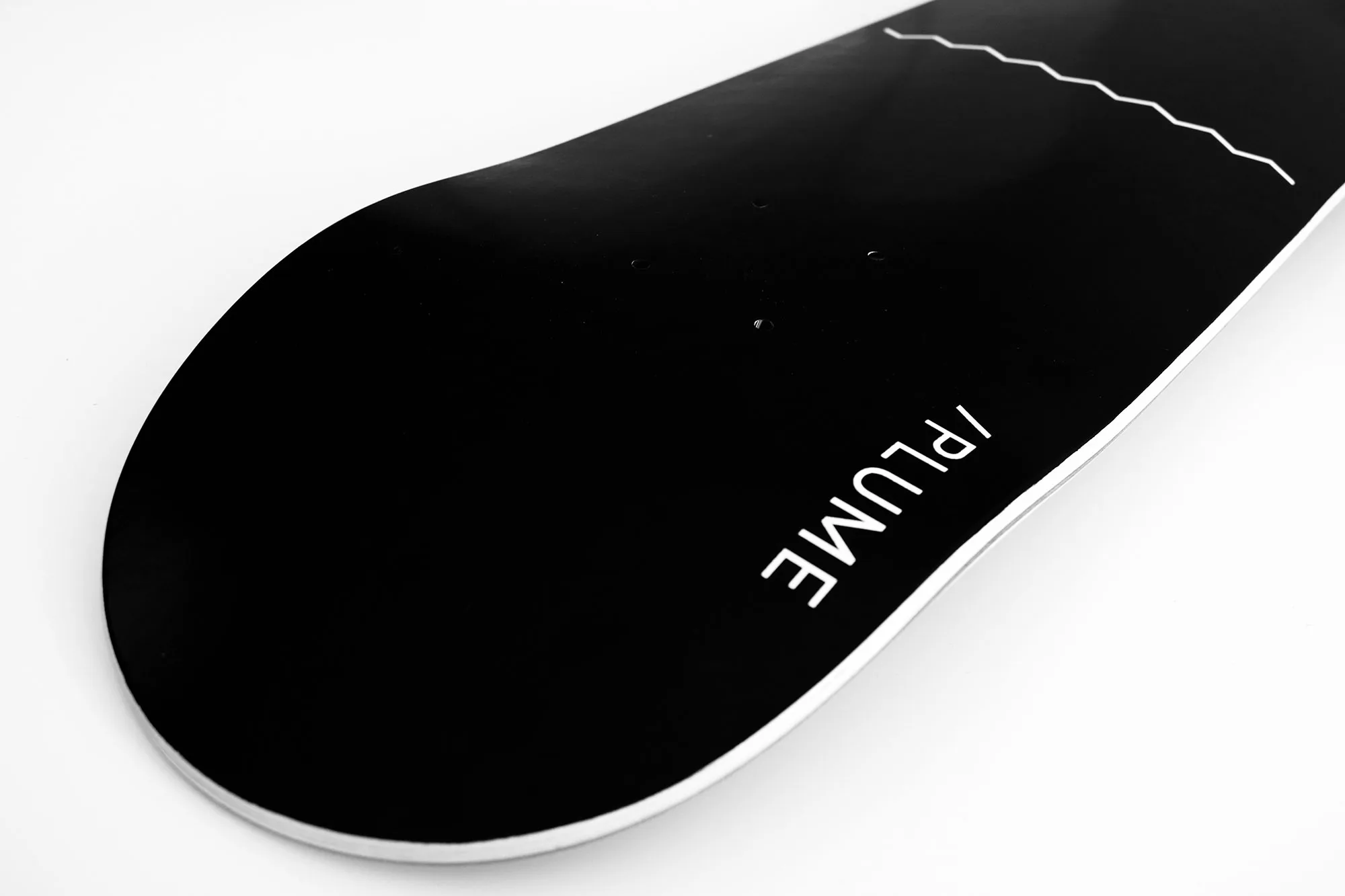
The boards followed the same direction, defined by strict geometries, controlled proportions and a deliberately reduced palette – primarily black and white – without unnecessary decoration. Each deck became an exercise in visual restraint and balance.

Production
After researching various manufacturers, the project moved forward with reliable partners capable of producing high-quality decks. This led to an initial board series, followed by a second collection with new graphic variations, along with matching shirts and accessories that completed the visual system.

A shared project
The project also benefited from the perspective of a younger family member who was just beginning to explore skateboarding. His curiosity and enthusiasm added a sense of playfulness to the process and helped keep the creative direction rooted in the joy of the sport itself.

The Result
Over its lifespan, Plume grew into a complete and cohesive brand system. It included two full board series, coordinated shirts and apparel, stickers, packaging and custom grip tape — all built around the same minimal visual language. The identity naturally extended into the digital space as well, with an online shop and social content reflecting the brand’s clean aesthetic.
The project remained active for a couple of years – long enough to become a meaningful chapter in the broader creative practice that shaped our approach to design.

Reflections
Plume was more than a skateboard brand.
It became a design laboratory: a way to explore how minimalism can live in physical objects as much as on screens. It was an exercise in coherence and discipline, and a reminder that personal projects often strengthen professional skills. It also carried a human dimension – a collaboration shaped by curiosity and shared time within the family.
Although the brand is no longer active, Plume remains one of the most meaningful examples of building a visual system from zero and allowing it to exist across real materials, products and experiences.

Focus
Brand identity, product design, graphic design, photography, video, social media, online shop